Visual update
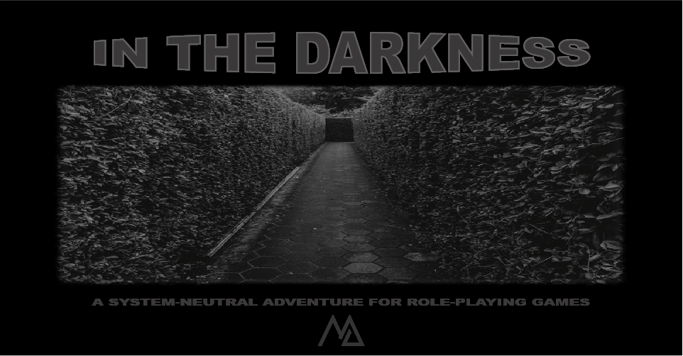
After having updated the appearance of my profile page and all my game pages to a new look, I started looking at the graphics of In the Darkness. When I worked on this collaborative project, I pointed out to the other group members that, if they wanted for any graphics to be included within the text document to make it a bit more pleasing to the eye, they would need to be royalty free stock images. One of the members said I didn't have to worry about it because she'd send me the pictures. And so I trusted her and have been using the images she provided ever since (it's been 2 years now), only to find out that they were not royalty free stock images after all.
Since I was already updating the graphics on all the pages, I went ahead and updated the graphics of In the Darkness a second time, this time with the new images. I also decided to go ahead and change the looks of the cards; it took forever to redo 160 cards into the new format, as well as make a back for them, but I really needed an excuse to play around with Illustrator again.
As I was looking at the lines on the cards, I realized that, from a player's perspective, it might not be all that obvious what you're supposed to do with those once your character becomes a ghost - being a one-pager, there are no instructions on the actual game since there wasn't enough room to include them, and there was also no mention of that on the game's description whatsoever. I added some more details about the game to its page (it was really not at all informative before) but I still felt like I needed to do something more to explain the point of the cards, so I went ahead and created a list with all the cards and what the context behind them was. Hopefully, that will help them make a bit more sense.
Get In the Darkness
In the Darkness
A grim system-neutral three-acts isekai adventure for tabletop role-playing games.
| Status | Released |
| Category | Physical game |
| Author | Minakie |
| Tags | Dice, One-page, one-page-adventure, One-shot, Print & Play, rpgpt, rpgpten, system-agnostic, system-neutral, Tabletop role-playing game |
| Languages | English, Portuguese (Portugal) |
| Accessibility | Color-blind friendly, High-contrast |

Leave a comment
Log in with itch.io to leave a comment.